

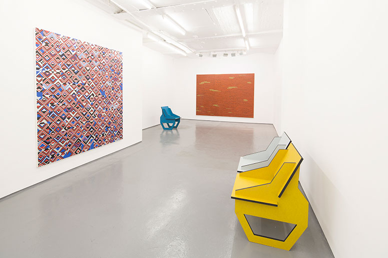
A restless influx of pattern and sensation permeates Dominic Beattie’s spectacular new work at FOLD Gallery. The four large works, and the stylish chairs, create an atmosphere that has a feeling of a 1970s hotel or gaming casino (Kubrick’s The Shining) – slightly casual in appearance, eruptive and coherent in equal measure. That experience is immersive; we are invited to sit and observe the interaction between the deco-repeated paper systems, constantly out of alignment, which draws us in to the painting’s edge and the dazzling picture spaces.
Prolific and compelling, Beattie’s approach in sourcing easily-available materials pays dividends in these geometric dissolutions. The anti-digital aesthetic is combined with shimmering movement. The mechanics of the picture-making, and the way he manipulates the space, are reminiscent of the Cubists’ approach, in creating a new materialization in 1909-10. The momentum in a work like Untitled (2015) instantly reminds me of Braque’s herringbone shading in his evocative still life interiors. Beattie parallels that illusionist rhythm, creating complex effects in space, handling the individual sections and mismatches with a speed and differentiation of surface. The ‘papier colle’ technique Incorporated into the surface has an emphasis on materiality, its cinematic superstructure creating a destabilising environment.
In the second of the large-scale works the flat silver-sprayed ground is important throughout the composition, as it opens out the space across the diamond-shaped grid. The chairs in the space take on greater significance, as they perhaps do in later Braque works, or in a Patrick Caulfield painting such as Dining /Kitchen/ Living 1980. The emphasis on place seems to carry more autonomy, as the invented orchestration is more frontal in this all-over, highly-modulated four-panel structure. The light reds pop out of the structure the most, like a micro Joseph Albers. The Indian yellow catches the eye at peripheral points in the work. There is a very powerful presence/ absence, suggested not only by this painting, but by the whole installation.
The third work is the most frontal in its approach. Made of strips of paper and aluminium tape, its economical dialogue between pasted paper and authoritative drawing highlights the speed of its making. The textures and patterns of collage are reprised in spray paint, ink and paper, topped off with layers of varnish. This gives a certain pulsation of movement in the space, reminiscent of the repetition in music by bands such as Kraftwerk, with their minimalist and strictly electronic instrumentation.
Beattie’s quest to create a vibrating optical space in his paintings is realised by a sharply-generated emphasis on the sensuous relationship between the physicality of the paper and acrylic varnish, and his conception of an all-over, richly-modulated surface.
The final work in the show focuses on this approach, with a greater system of sequencing. This work looks the most physically demanding. The mindset here, concerning the colour limitation and the scale of the drawing, echoes the work of Michael Kidner, with his depth of research into wave theory. Kidner’s rational mathematical construction seems to me to be an influence in Beattie’s untitled works, in their sense of chaos. This work has the modulated sense of a Cezanne landscape, full of structural integrity and systematic procedure; it pushes that boundary.
This show unlocks a transformation. The transforming process is a chaotic articulation, formulating questions of futurity, movement, and speed, and we revel in this exchange. The works’ low-tech material construction and profound spatiality inject a sense of anticipation of disorder/order and reorganization, amplified through dissonance and emotional resonance.
by Laurence Noga


