

by Sam Cornish
Three shows by artists more or less of my generation trying to find a way around modernist abstraction, or at least, using something aspect of its visual language to make their art. Whilst for me none of the exhibitions completely reach beyond this starting point (do not strike upon something which seems completely new or completely convincing) each contained something of value.
At Tintype there were paintings and constructions by Jost Münster. Münster’s paintings are ramshackle, almost folk-art geometric abstraction. As with much folk-art line is their strongest element. There was lots wonky pattern and a slightly shabby, knocked about jauntiness. Often this jauntiness shaded into a kind of ‘personality’ – the sense that a painting or sculpture, or the image they contain, has a cartoon-like persona. This is something I’ve written about before. You see quite a bit of it in contemporary abstraction, a variety of the whimsy which much current art seems to cling to as a retreat from the glossy high-end production values of Jeff, Damien or Gerhard. In general it can be an easy get-out clause from the difficulty of focusing attention more abstractly (and can be gratingly ingratiating, with an obvious appeal that feels manipulative, as if you trying to see past a suit salesman’s ready smile). Yet at times Munster makes it work, by keeping it just at bay, by working just abstractly enough.
The paintings were small, generally orientated as portraits, and, in line with ‘personality’, worked best when the image was in tune with the portrait format – when the motley assemblage of line and shape formed a single structure within the rectangle, and felt a little as it was facing forward, looking at you. The paintings had agreeably tough surfaces, built from layers of paint. This toughness was such that some of the paintings stacked at the back of the gallery looked pretty much as good as the best of those hung on the walls. It was also to their advantage when the pattern was embedded within the surface, as it gave his line a greater physicality. Less successful were those that attempted atmospheric colour in thin washes. Overall there seemed to be something of a quality-control problem – perhaps either with making work with a great enough sense of purpose to begin with, or with knowing how to recognise this in the end result (which might explain the works stacked at the back of gallery). In too many of them there was a feeling of a half-hearted formalism, the sense of cautious experimentation in too many directions, without resolution, or without drawing conclusions about which direction was best to proceed in.**
The most convincing thing in the show was the large hanging construction, made from lengths of bamboo wrapped in fragments of canvas from discarded paintings (given the by-numbers press-release spiel about resurrecting painting that could be attached to that fact, I rather wish they weren’t). From speaking to the gallerist, I gathered this was something of a new development for Münster. For a previous show he had made a similar construction, which in photographs seems to hang as a rather limp grid, flat against the wall. The current work looked much more successful, giving freer-reign to his cartoon-like line and allowing an energy and tautness not matched in the canvases on display. I understood that the original intention was to hang it in the gallery window, but it had been moved into the centre of the gallery so it could be seen from both sides. Personally I would like to see Münster take what seems to me the obvious next step and build his drawing so it begins to free itself from the plane, and can move in something approaching three-dimensional space.
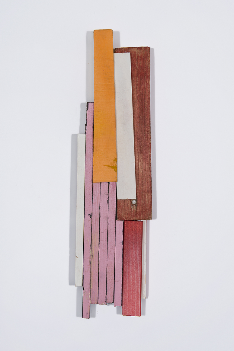
In his catalogue essay for Dominic Beattie’s exhibition at Fold Gallery Ben Street evokes the well-worn favourite ‘modernist purity’,*** and, seemingly paying no attention to the work apart from a bit of art-historical referencing, positions Beattie as a kind of provisional painter. Though pretty on trend, I thought this was probably misguided before seeing the show, and certainly think it is now I’ve seen it. Beattie’s was the exhibition I enjoyed most on my day round the galleries – they are undoubtedly attractive things and it was good to see such a complete focus on visual invention. But surely Street does not think this work is less pure than Picasso or Schwitters? Or Braque? Or Gris? Or in a different way, Tatlin? Or pretty much any of the artists Beattie could be compared to? To pick less canonical examples more or less at random: Prunella Clough? John McLean? To position the show as an advance, or at least a new development is all talk, and does Beattie himself no favours.
In fact what holds the work back – what prevents Beattie’s talent and inventiveness becoming really exciting – is an excess of purity, or at least too tasteful decision-making. Primarily Beattie is too dependent upon the inflected verticals of Cubist construction. I would like to see him break up the verticals, and allow his work to spread more freely across the wall. A couple of the constructions hinted at this (most intriguingly by slyly turning their shapes inside-out so they became subtly involved with the space around them), but never quite took the plunge. Breaking the verticals would likely involve a break with his very restricted scale; particularly in the case of the striped constructions there seemed to be no real reason why they stopped where they did, why they couldn’t continue to 2, 3 or even 10 times their current height – the risk of absurdity might be one worth taking. A larger size might also give Beattie an opportunity to contrast his admirable neatness (the smile-inducing skill with which he playfully nips and tucks his structures) with something a bit harsher, baggier, more choatic – and in the end more wide-ranging.
Some of constructions hinted at figuration, resembling a schematic upright human figure or a head in a portrait. This was accompanied in a few where twinned circles were difficult not to read as eyes. Perhaps (perhaps, perhaps…) one way of moving beyond his current work would be for Beattie to really embrace this latent figuration, pushing beyond the ‘personality’ that is more apparent in Munster’s work, and making it something more overt. Again a good dose of absurdity could be a good thing. Of course this categorical confusion is something many of Street’s supposedly pure modernists would have no problem with at all.
The exhibition I felt most conflicted about was Alice Browne at Limoncello (incidentally the youngest of the three artists, though the one who has been on my radar the longest). I haven’t particularly liked Browne’s paintings in the past. They seemed too vague, too tentative, like the beginnings of paintings that either didn’t have the means or the desire to fully step over the threshold and really stand-up for themselves. I am not sure the exhibition completely won me over. But it kept me engaged longer than I had expected it would, and, more interestingly, some of the individual paintings lingered in my mind for the rest of the day. Beattie and Munster could be said to be too narrowly concerned with formal issues – for me Browne is not concerned enough. Yet I think there is something to the paintings, a concern with particular experiences, light effects or emotional states – a distinct sensibility that is visible even through the sloppy handling, the basic colour combinations and tints, scuffed in. Browne’s is evidently interested in marginal, furtive, fragile, only-just-there sensation and the constancy with which she worries away at this is, I think, in her favour.
In part Browne’s paintings work by gently merging a half-figuration with the basic building blocks common to lot of abstract painting. Or could I say she lets them fade into each other, leaving both to glimmer more or less faintly? The rectangles that construct the wall-like surfaces of a painting by John Hoyland or Hans Hofmann become boulders roughly stacked upon each other (for me these were the pictures that I found it hardest to get along with); or else are tilted into perspective so they resemble schematic renderings of a set of shelves or the inside of a box. In this merging of the language of abstraction with figuration Browne resembles Basil Beattie (who I don’t think is relative of Dominic’s?), whose show at Hales I saw later in the day. The Hales press-release quoted Beattie describing himself as a ‘sort of symbolist’ – this seemed appropriate for Browne as well. Beattie’s paintings are clearly more confident, more accomplished than Browne’s – which should be expected of the work of an artist with five decades of experience, rather than five years. But Beattie’s work seemed to me a dead-end, a working out of a fixed repertoire of motifs which, for all their clear representational content, feel remote from lived experience. Rather than going down a dead-end I feel (or at least hope) Browne has not really got going yet. With a bit more precision, a bit more certainty, a little less reliance on linear and figurative ways of creating space, the faint but real sense of fidelity which Browne’s best paintings have could grow into something worth attending to.
* Really this sense of a low-key personna in abstract painting goes back to Malevich, and can be seen in minor, idiosyncratic mid-century modernists such as Auguste Herbin or Peter Kinley, and I’m sure many others.
** I realise that, like many writers on abstract art, I use formal, formalist and formalism in a variety of different ways and as both a positive and a negative. But I hope my meaning here and elsewhere is clear enough.
*** A pretty common trope of course. For other instances see almost all of John Yau’s articles on modernism for Hyperallergic.


