

by Sam Cornish
At the beginning of the year I reviewed a show by Dominic Beattie at FOLD Gallery. Since then I’ve spoken with him on a few occasions about – and in front of – his paintings, at his gallery and in his studio in Lee.[1] At first this text was meant to be a transcribed interview, but evolved a little (at least initially because of my dislike of transcription). The first few paragraphs mainly lay out Beattie’s thoughts on his work, such as I remembered them, whilst toward the end I put forward my own opinions.
Beattie does not want to make work with a sense of permanence or which towers over the viewer (so no ‘monuments’ and no ‘monumentality’). He enjoys using cheap materials, both from a pragmatic point of view, and for the feel of tape, hardboard, marker-pen, Tippex. Oil paint is too ‘historic’ (though he admits this is not a radical impulse), at any rate that it would be impossible for him to work with. He is aware of the relation of his art to modernism – though at least initially specific connections were pointed out to him, rather than consciously sought. His attraction to modernism can perhaps be best described as generalized – he mentioned that the beauty of modernist furniture and design might have been his way in.
A preference for the brittleness of hardboard or the speed with which a line of gaffer or electrical tape can be laid down is important because he thinks through his material. If those are not the words he uses, at least he calls himself a ‘maker’, more than a ‘thinker’, and believes that if he too completely envisions a work in advance it almost always fails – with the most effective parts of his paintings often the ‘happy accidents’, rhymes and visual coincidences that could only be arrived at through improvisation. He attaches a lot of importance to an intuitive rightness, a visual punch – a successful work ‘pops’. Though he works quickly, a painting may contain a number of different layers, often disguised, or only visible from a side view. When looking at other artists’ work he is chiefly excited by evidence of decision-making, especially when it is difficult to understand precisely what the thinking could be behind a particular choice.
He sees the work I reviewed at FOLD as a group slightly to the side of the mainstream of his production. Intriguingly he calls them ‘constructions’, whilst the bulk of his production are ‘paintings’. Given the manifestly constructed nature of his ‘paintings’ I could not quite get the bottom of this distinction – but I think it may lie in the fact that the ‘paintings’ always relate to a rectangle, where the ‘constructions’ mostly do not. It is likely not very important to completely unpick the logic. They are always portrait – he confessed that he hated the landscape format. The classification of these two types (in English at least) is a reminder of how bluntly we can be affected by shape; shape experienced in a manner that is highly conventionalised, and yet seems related to our basic sense of how the world works (of course the prevalence of the former could well have given the latter the appearance of naturalness). The pervasiveness explains the strength of Beattie’s aversion to what is after all simply a rectangle that is wider than it is high.
I wrote previously that some of his constructions felt like they had personalities, as if they were schematic or very abstracted heads or figures. This quality – which is a type of coherence, and a type of appeal to the viewer – is something which is also often found in the paintings as well. It is a quality I’ve found annoying in the work of other abstract artists – partly I think because it seems a cheap trick, an easy get out clause; and more so because it seems to make demands on me as a viewer that I do not want imposed. A rarefied and much more complex working of a dislike of something like ‘personality’ underpins Michael Fried’s grand history of modern painting (and discussion of sixties sculpture). For Fried, David Gericault, Courbet and Manet all came ‘to grips with one primitive condition of painting – that its objects necessarily imply the presence before them of a beholder’; whilst ‘the very best recent work – the paintings of Louis, Noland, Olitki, and Stella and the sculptures of Smith and Caro – were in essence anti-theatrical, which is to say they treated the viewer the beholder as if he were not there.’ [2] Something of what Fried says here seems true to my own experience, though I am a little wary of (or maybe just intimidated by) his theoretical certainty, and of the cul-de-sac which the painting he championed disappeared into. This doubt makes me happy to repeat the (slightly perverse) suggestion I made in my review that the sense of personality in Beattie’s work could be amplified, that a dose of absurdity might be a good thing. In general he could do with pushing outside his somewhat limited range; working on the occasional glimmer of ‘personality’ still seems a good a way out as any – if not to make ‘personality’ completely dominant, then at least to allow it to unsettle what is more comfortably abstract in his work, to oppose its turning away with a fragment of a wink or a piercing stare. Perhaps the purists (including those within both Beattie and myself) need to be irked? It is intriguing to find out that Malevich often wrote about his abstract paintings as portraits…
On his website Beattie presents his paintings in a long line, which you see by scrolling from left to right. He sees them as a potentially never ending series, with groups such as the ‘constructions’ temporary diversions. He has, I think, always displayed them in groups (he has mentioned that six is a good number). At the Saatchi Gallery (January – May 2014) they looked striking, occupying one end of a long gallery, legible at distance and much more confidently visual than any of the other things on display. As well as giving these quite small works a greater chance to hold the wall, putting them in groups also gives the pleasure of comparison, which is one of the best ways of thinking visually. When we were shifting through a number of recent works at FOLD it occurred to me that the best combinations showed different strands within his painting against each other. Most of the works gained by this contrast, but it did lead to the more worrying thought that the weaker works gained more, and that they should perhaps be eliminated unless they could more securely stand on their own two feet. One way of giving his works greater independence would be to make them larger (their size is certainly something of a safety net). I gather that this is something he is working on, and that has been discussing whether it would be best to keep the basic size of his units but have more of them; or to keep roughly the same number of units, but increase them in size. My instinct is that the latter seems more likely to be profitable.
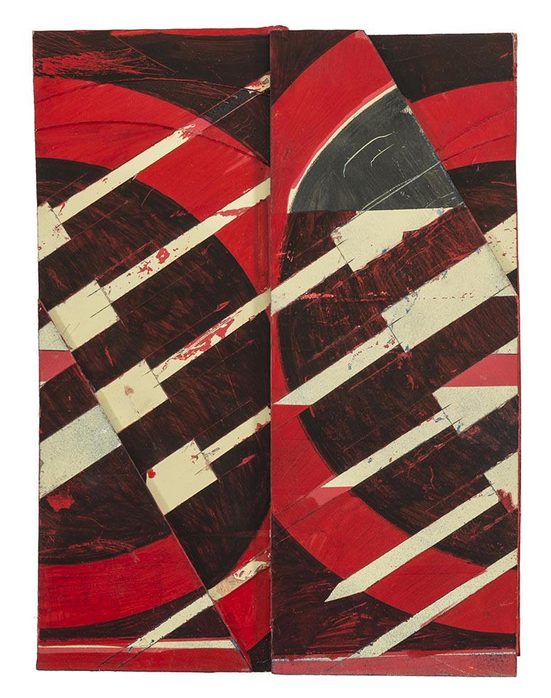
The most pleasing quality of Beattie’s art is its physicality, when he achieves a solid, tactile image, with figure and ground fused together. Generally he will build up layers before cutting through them and rearranging these parts, quickly arriving at combinations be could not have foreseen, and cannibalising nearly completed works into each other. In the best of them the decisiveness with which he cuts his material (on occasion he has used garden shears to chomp through layers of hardboard) meets an equal decisive fusing of his parts into a single unit. Occasionally he will cut a nearly finished piece in half and flip the parts around – disrupting the pattern he has made and avoiding parts tastefully balanced on a background (works which are conventionally composed tend to be less successful). This ‘flipping’ produces his most eye-catching works, involving a tension between inside and outside, the object-like boundary pushing in, whilst the parts that form the boundary push outward. Sometimes the repeated patterns seem to grow larger or smaller, as if they were pushing out at you in sequence, an abstract – and muted – version of the way early Pop artists would present images juxtaposed at different scales; or elsewhere they resemble the roll of film stuck between two exposures (like ‘personality’, these attributes could be rammed up a notch, stretched closer toward breaking point). Elsewhere, as in the work below, the disruption of pattern creates a less dramatic image, a more dispersed meeting of repetition and difference.
The meeting of fusion and disruption (or art and life) has been central to collage since its adoption by modern art a century ago, with apologists for different strands of modernism emphasising one pole or the other. Yet it is a little misguided to demand that collage should aim at wholeness, a restorative resolution, when disjunction is so central to our encounter with it; [3] whilst the current fashion for failure or formlessness without a supporting or opposing pictorial architecture is academic, in that it results in things that are to be drily polemicised about rather than looked at. What is needed is vividness, a drama or a standing to attention reached with enough agility to allow work to continue, a structure that strikes whilst avoiding a potentially lifeless completeness. [4] Beattie, it seems to me, is making positive moves in that direction.
[1] There is an undeniable pleasure in meeting someone from the art-world familiar with my home patch of south-east London – Hither Green, Mottingham, Eltham, even out through Chislehurst and into Orpington!
[2] Absorption and Theatricality, 1980, pgs 4 & 5
[3] which is why Matisse’s cut-outs stand to one side of the collage tradition. As John Elderfield put it: “Collage focused attention on the balance and reciprocation between the real and painted, between reality and art, and on their conflicting claims – which the particularly modern self-consciousness about the autonomy of art had made newly self-evident. Matisse’s art in contrast, was an attempt to resolve that competition, to find ways in which to keep in contact with reality all the more. Simply to juxtapose the natural and the artificial, as collage did, was therefore of absolutely no interest to him. From the first he wanted accord, to recover the balance between art and nature which modern awareness of the artificiality of art threatened to break”, The Cut-Outs of Henri Matisse, 1978, pg 10; my review of a show by Francis Davison is perhaps also relevant here.
[4] These ideas are discussed at a much higher level in the opening chapters of Christopher Green, Picasso: Architecture and Vertigo, 2005


