

By Andrew Parkinson
Working for a day in central London, only yards away from New Cavendish Street where FOLD Gallery’s summer exhibition Kaleidoscope, curated by Dominic Beattie, is on show, I get my lunch hour to go and see it. Having learned from the publicity flyer that the seven artists, Dominic Kennedy, Mali Morris, Bridget Riley, Julian Wild, James Alec Hardy, Selma Parlour and Martin Maloney, work with colour in “radically different ways” each one presenting “a unique vision of how to liberate colour to stimulate and energise the viewer” I wonder if I can discover in my short visit what it is that they are doing differently with colour.
I already know that in a work by Bridget Riley I will find a clear structure within which colour can do it’s thing, where individual colours will change in relation to each other depending on the specific juxtaposition and where the overall colour sensation will change, structure being essential not for control but rather so that the colour can achieve free play. So when I see the Riley prints here, About Lilac (2009) and One Small Step (2007), I get what I expected, but the experiencing of it is, as always, surprising.
In Selma Parlour’s fascinating paintings, there is also this freeing of colour by keeping the drawing precise, but with Parlour it’s more minimal. In Metapainting (One for Each Eye 1) 2015, Metapainting (One for Each Eye 2) 2015, and One for Each Eye 4 (2016), two rectangles of different colours, oil on linen, in thinly painted veils allowing the white underneath to shine through as in watercolour painting, are presented to the viewer as one rectangle for each eye. I take the titles as an invitation to stare, as one might do in a visual cognition experiment. Almost immediately after-imaging and merging of the two colours begins to take place, a hazy third colour sometimes appearing. In One For Each Eye 4, I start to see a rainbow in the white space between the two rectangles. I cross my eyes slightly which enhances the perception of the rainbow down the central divide. There is no doubt that my engagement with these paintings has its own unique quality, akin to experimentation, triggered specifically by what the artist is doing with colour.
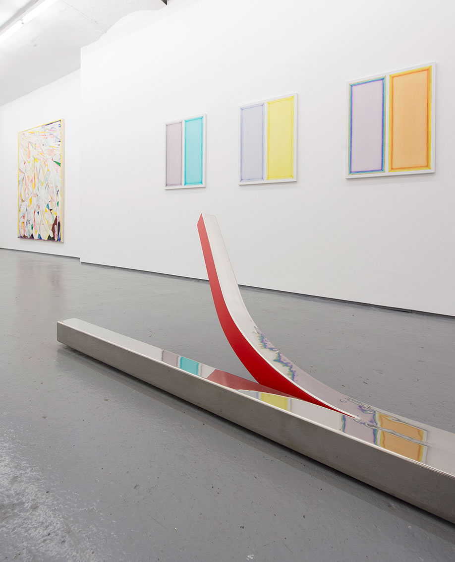
If the attention I give to Parlour’s paintings has this quasi-scientific quality, that doesn’t seem quite so appropriate for the Julian Wild sculptures, though here colour is also used, at least in part, to reveal aspects that might otherwise be hidden. I think it is the case that in both these sculptures the “inside” of the object is demarcated by colour and re-positioned so it is “outside”. In Peeled (2015), a wonderfully polished stainless steel bar, presented horizontally on the gallery floor, is divided down the middle at one end and one half of the divided section is bent upwards and out and coloured bright red, whereas in Himalayan Balsam (2013), a bright pink colour is used to explicate the inside and outside-ness of a vertical knotted steel bar.
In Dominic Kennedy’s painting Slowly Fading Forms (2016), colour perhaps does the opposite of what it does in Wild’s sculptures. In the Wild sculptures colour makes explicit, along the lines of “colour coding” but with a much stronger emphasis on sensation than any code might exhibit. In the Kennedy painting colour dissolves form, rays from a summer sun dazzling rather than revealing. The sun is represented in the top left hand corner of this near seven foot canvas. In the rest of the picture the sun’s rays meet dissembling forms, all held within a shallow near-cubist space that hints at deeper spatial recession in the top right hand quarter. Forms and rays of light merge so it’s difficult to differentiate the two. Colour describes form only long enough to depict its dissolution, even whilst materially constructed in oil paint, oil stick, crayon and pencil, with wood, felt and pins stuck on here and there, yellow felt strips making up a slim frame around the image. Here colour represents and symbolizes, or does it go only so far as to suggest or connote that ‘beneath’ the illusory appearance of solid forms, all of matter is sub atomic flux?
There is perhaps more description of appearances in Martin Maloney’s Studio Flowers #47, (2016), but this painting is by no means an observational study. A bowl of flowers is undoubtedly represented, but in semi symbolic style. Taking a cartoon impressionist approach to depiction, blobs of pink are flowers and red diagonal bars are stems, with green dashes for leaves, emerging from a terracotta semi circle that must be a plant pot and all against the blue/green of the studio wall that also pushes forwards spatially to interrupt the rhythm of the red bars and green dashes. The naming of colours comes to mind, how certain colours are so associated with certain objects or experiences that each is named by the other: orange, sky-blue, lime, lilac, green grass, fuchsia pink etc.
James Alec Hardy creates video installations using obsolete analogue equipment from TV studios, displaying arrangements of monitors as symbolic motifs. Here 160804 comprises eighteen VGA monitors forming an S shape that produces a negative cross above the centre, showing the same images on each screen but rotated physically in that the monitors themselves are different ways up. The images are generated by setting up feedback loops with analogue video processors. Without the use of cameras, or external input, obsolete analogue broadcast and editing devices, are connected in sequence, and manipulated in real time. Jerky changes of colour and image in the video are the result of the artist’s hand manipulating the devices. A computer is used only to digitise the video for playback purposes. A progression of colour and shape presented simultaneously by each monitor, fractal like, coheres into an overall image whilst continually changing, like a kaleidoscope. As what’s presented changes the overall ‘mood’ changes; I have the feeling that sounds are involved but I am not hearing any. I could have this completely wrong, but the sense I have is of something approaching colour/sound synesthesia.
The analogy with music is appropriate for many of the paintings here, and none more than Second Stradella (2016) by Mali Morris, even though only Hardy’s video installation shares with music the quality of being played over an actual time duration. Over six foot tall, not quite square, a grid of twenty rectangular colour cells taller than they are wide, some of which are divided by a curve creating two shapes of contrasting hue and seen together suggest a large circular shape competing with the grid formation, is the visual equivalent of a multiplicity of chords being sounded together. Yet all is not strictly simultaneous. Perceptual figure/ground shifts create change, movement and depth that are specifically two-dimensional. If one shape/colour stands out way in front of the others there must be quite a deep space here, but no sooner have I perceived it than it snaps back into its flat presentation, only then to make way for another cell, shape or gestalt to project outward or to recede. All this without the slightest hint of linear perspective. Not one of the colours here is the same as another, the curving pink triangles on the top row that look similar, are not identical. The one on the left is slightly darker, more saturated and shinier than the other. The blacks and whites are never actually black or white, and again none are precisely repeated. It is difficult to show this in a photograph but the two jade green/whites in the second row up are not the same colour, nor are any of the black/greys on that row. It’s difference within sameness and things never being quite as they seem that I become mindful of now.
The sameness in the exhibition is these artists involvement with colour, the differences are their particular approaches to it. The variety keeps me interested for longer than this lunch hour really allows.


